
This is my watercolour/Asian version. No paints were used to produce this effect; just some Photoshopping
making good use of the "Difference" mode which more or less inverts colours.

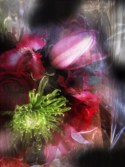
This version uses Kim's texture "Daisy" as an overlay
( the layer I converted to "difference mode"
in the "watercolour" rendition).
I also made use of the clone stamp to fill in the area at the top with more light,
using some of the shiny areas from the bottom
(sort of like a skin graft).
And this is the photo I began with
(notice the dark area at the top
that I cloned out in the previous image).
It was a lovely bouquet I received,
a few years ago now,
a few years ago now,
arriving under protective cellophane,
giving that sparkling sort of magic effect.
Any sign of blossoms in your neck of the woods as yet?
This is as close as I've come, so far.
They are both beautiful and it's hard to pick a favorite.
ReplyDeleteI'm glad you like them both! Thank you for stopping by to smell the flowers.
DeleteWhat a fun way to play with these edits.
ReplyDeleteIt's way too much fun, playing in Photoshop! Thanks for visiting.
Deleteall of them are great, but the last one is my favorite. DIVINE!!!
ReplyDeleteand no signs of spring here, too... i´m in despair!!
Ah, I am intrigued that you prefer the last one. It has a bit more "black magic mystery" to it, I think. Courage, Johanna...spring has to pop up one of these days. Doesn't it?! Fingers crossed; holding my breath...
Deleteoooh, thank you for these lovely bouquets. both are beautiful. no flowers or anything here yet. but at least i can see the ground.
ReplyDeleteHaha, it's very telling when we find reason to rejoice in being able to see the ground! I can see a few soggy yellow patches dispersed here and there in the fields of snow. Am trying to be encouraged by that.
DeleteLove what you did with these images!
ReplyDeleteThanks! So nice to meet you. I love your blog name and that colourful bit of textile art you have as your avatar (I believe that's the correct term).
DeleteI like them both...the background on the second one is so lovely and the purple flower in the first makes me smile...both beautiful!
ReplyDeleteWe are all at bloom here...bird of paradise is in its glory as are the flowering trees! I remember the spring in the east always seemed sweeter because the anticipation was so great!
Oh, lucky you all in bloom--with birds of paradise no less!! Everyone around here is more in the throes of despair rather than anticipation this year, it seems. Although, I must remind myself that I traditionally mark April 15 as the "all clear" sign of winter and start seriously getting my hopes up for the real spring. Ah, flowering trees you say...makes me giddy just imagining it... I know once spring finally hits here, it all goes with an amazing rush. Thanks for reminding me of this!
DeleteI like the first one a lot!!! It makes me happy!
ReplyDeleteHappy Easter!
Katarina
Ah, lovely praise indeed, that a piece of my art makes someone happy to look at it! Thank you. Happy Easter to you, as well.
Deleteoh they are truly beautiful... thank you so much, i would have never thought that cellophane can provide so much creative magic :-)
ReplyDeleteas everyone else here, i love both, though i tend to prefer the first one, if you forced me to answer that question :-)
Roxana, I would never force you to do anything, but I am happy to hear you provide your quite unprovoked preference for the first rendition of the bouquet. Don't you think it would make quite a lovely design for a silk kimono to wear while sipping your tea or having your lovely long hair combed?
DeleteWOW - it's clean lines that fad into one another making it seamless and powerful - perfect -- indeed - Thank you for sharing your editing process. My favorite is #1..my eyes are caught-up into the effects that seem to be reflections.. LOve it!!
ReplyDeleteHugs
"Seamless and powerful"--fantastic words to have applied to one's art! Thank you so much. I like that you describe the first picture as having "clean lines"; the bouquet is really reduced to its essence there, isn't it?
DeleteThank you for the invitation. I have lots of flower pictures sitting in my files that I would love the opportunity to share... Glad you like the ones you see here.
ReplyDeleteHappy Easter to you, too!